16
Jul
A Thousand Words or So on Book Covers
They say a picture is worth a thousand words . . . I’m sure that phrase has been written a billion times in relation to book covers, but there’s no denying the power of a good book cover. Just among my own authors, I can point to covers that made or broke books. And in the process of developing covers, the differences of opinion can be quite striking.
When I was a young editor (like, literally, a young editor; I was twenty-five) I got into quite a bit of trouble with the copy chief at the Berkley Publishing Group because I showed one of my authors the back-cover copy for her book before it was approved. I wasn’t very happy with it and she happened to be a copywriter by profession and the author of the book, so I thought she might want to take a crack at it. Apparently this was horribly naïve, as I was soon called on the carpet for sharing it.
Consider for a moment, though, that the copy that had been delivered had been written by a freelancer who had likely been paid $100 and almost certainly had not read the whole book. He or she had read the tip sheet I’d written about the book, and perhaps a chapter or two. Whereas the author, a professional copywriter who had written the book obviously had a lot more invested and much greater motivation to get it right. But, still, silly me for forgetting the importance of office politics.
So imagine what would happen when you show an author a cover before it’s final.
Very, very few publishers give authors approval over their covers. Some don’t even want to give consultation. The only author I believe I know to have gotten approval was Kirk Douglas. I was at Simon & Schuster when The Ragman’s Son was published and distinctly remember he had approval over the cover, which was logistically a lot more challenging before email or even color copies existed. But I digress.
Consultation is an interesting word. If you look up the definition of consult and consultation you find it means to ask someone to consider something. Merriam-Webster’s online dictionary goes on to say, “If you are consulting someone on something, it is more likely that you are seeking advice (‘he consulted his doctor before deciding on a course of treatment’).” In effect, cover consultation is meaningless. It might as well be notification. I have told authors that a publisher could wave the cover at them from the other end of a football field and say they had “consulted” them on it. I have seen publishers send authors the solicitation cover—the printed cover sent to bookstores to solicit orders—to meet the contract requirement of “cover consultation.” Could changes be made at that point? Sure, if Barnes & Noble asked for them, but almost certainly not if the author asked for them.
That said, Tom Doherty, the founder and Chairman of Tor Books once said to me, “Authors want covers that make sense once you’ve read the book. Publishers want covers that will help sell the book.” And that makes a ton of sense. It would, in particular, explain crappy books with great covers. What it doesn’t explain is great books with crappy covers.
Case in point, from a book published by Forge Books, written by a former client of mine.
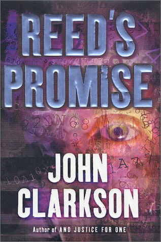
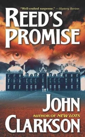
The reviews for this book are very strong.
“Writing a thriller on a small scale is harder than crafting a country-spanning tale of international intrigue, primarily because there’s an inverse ratio between location and verisimilitude: the more international the setting, the lower the bar for realism. If the story unfolds in the reader’s backyard, then it has to be anchored in reality and there’s reality in spades in this engrossing novel by Clarkson. . . . As Bill engages in showdown after showdown with the institute staff, it becomes clear that the premise of this novel is in part an excuse for Clarkson to examine characters under stress and craft grueling scenes of physical effort. This engaging thriller is equipped with psychological depth and a solidly believable center.”—Publishers Weekly
“It would probably come as no surprise to anyone familiar with Clarkson’s books that the author is also a screenwriter—his novels feature sharply drawn characters in realistic, dramatic situations. Reed, still dealing with the loss of his leg, a strong man forced to cope with unexpected weakness, is like few other mystery protagonists. Reed definitely merits his own series.”—Kirkus Reviews
This is a novel about a young man with Down Syndrome who has been institutionalized. His uncle, who has not been much in his life, has recently been injured and become an amputee, and thus is dealing with his own physical and emotional challenges. But when he receives a letter from his nephew, he knows he needs to find out what’s behind it.
What follows is a very unusual thriller, told from the perspective of the young man and the uncle (and others, but those are the primary POVs). It’s emotional and at times disturbing. I truly felt for the characters.
But, tell me, do you get any of that from the covers? Certainly these covers do not work if you have read the book; there’s no doubt of that. But do they work to sell the book? Do they interest you and make you want to pick up the book and buy it? The hardcover had some potential, I think, but makes me wonder more if this is a story about a savant who is good with numbers or codes. The cover of the paperback does literally nothing but communicate dread and foreboding. It could be a horror novel or a novel about a serial killer. But that cover sure as hell is not telling me anything about what this book actually was, nor was it enticing me to pick it up and check it out further.
Similarly, let’s look at the covers for Marc Turner’s first book, When the Heavens Fall, a hardcover from Tor, and a trade paperback from Titan and Heyne (and Random House Korea, if you happen to speak Korean).
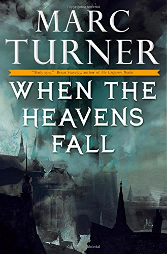
Again, this is a book that had very strong reviews. It received a starred review from Kirkus, which is famous for being very difficult when it comes to giving positive reviews.
“The characters, whose personalities drive the narrative as much as the clash of magics, battle through page after relentless page of grim, desperate, surprising, and often enthralling action. Equally satisfying, the ending wraps things up without annoying and taunting cliffhangers.
“A splendid launch. Turner’s unquestionably a newcomer to watch.”
My question to you, dear reader, is, Does the Tor cover in any way tell you this is (1) a fantasy novel (2) a novel full of “enthralling action” or (3) intrigue you at all? In short, does it sell you the book?

The Germans, unfortunately, did not do much better, despite having acquired the book with great excitement. I remember an email from my German co-agent in which the acquiring editor was quoted as saying this could be the start of a new Game of Thrones. Now, they changed the title to Shadow Rider in German and gave us a dark cover that again barely communicates anything about the book. Sure, if you read the type, you might notice the quote from Brian Staveley, which would tell you it’s a fantasy. In English, it says, “Turner has created a powerful fantasy where mystery and magic pervade each character, each quest, each corner of a vast and vibrant world. . . . The battles and betrayals that fill the pages of When the Heavens Fall are truly epic in their scope and impact.” ―Brian Staveley, author of The Emperor’s Blades

Which brings us to the UK version from Titan Books. Arguably, this was the best cover, because it did clearly communicate (IMHO) that this was a fantasy. And it had a sense of action. But it was very much a cover created with stock art and despite that they spent the money embossing the cover type, I think it still ended up looking too “genre” to attract readers. Certainly it didn’t look like a best-seller. And regardless of what we say, all of us do just books by their covers, often choosing to pick them up based first on the cover or author name and second on what the text on the cover says.
The bottom line is that the success of a book can be made or broken by the cover, but authors have little to no say about what goes on the cover of their books. So, the next time you see a book in a genre or subject you usually read, but aren’t intrigued by the art, pick it up anyway and take a closer look. Because it may be a fantastic book that just happens to have a bad cover.